
Introduction#
This post records two ways of running principal component analysis (PCA) in Python and visualizes the two-dimensional results.
What is PCA?#
PCA is an unsupervised linear transformation technique, and it is one of the first methods to reach for when you need to reduce the dimensionality of a dataset. It helps reveal the underlying structure of the data, it reduces the computational cost of downstream analysis, and it lets you present high-dimensional data in a two- or three-dimensional coordinate system.
What does reducing dimensionality mean? Suppose you have a five-dimensional dataset:
| Id | 1-d | 2-d | 3-d | 4-d | 5-d |
|---|---|---|---|---|---|
| data-1 | 1 | 2 | 3 | 4 | 5 |
| data-2 | 6 | 7 | 8 | 9 | 10 |
| .. | .. | .. | .. | .. |
After PCA, you can keep only PC1 and PC2 and plot the data in two dimensions:
| Id | PC1 | PC2 |
|---|---|---|
| data-1 | 0.3 | 0.6 |
| data-2 | 0.1 | 1.2 |
| .. | .. | .. |
PC1 and PC2 are the projections of the data onto unit vectors chosen so that the projected data has the largest possible variance (its distribution is as wide as possible) and the components are uncorrelated (covariance = 0).
Algorithm#
- Standardize the \(d\)-dimensional raw data.
- Build the covariance matrix.
- Compute the eigenvalues of the covariance matrix and their corresponding eigenvectors.
- Sort the eigenvectors by their eigenvalues and stack the first \(k\) of them into a matrix \(W\) (with \(k \ll d\)).
- \(Y = XW\) is the data reduced to \(k\) dimensions.
PCA from scratch#
Import the necessary modules:
import pandas as pd
import numpy as np
import matplotlib.pyplot as plt
from sklearn.model_selection import train_test_split
from sklearn.preprocessing import StandardScaler
Load the raw data:
# get  data set
df_wine = pd.read_csv(
    "http://archive.ics.uci.edu/ml/machine-learning-databases/wine/wine.data",
    header=None,
    engine="python",
)
# check data
df_wine.head()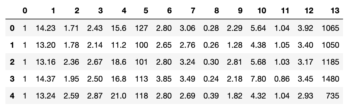
Split it into training and test sets:
# create train and test data set

X, y = df_wine.iloc[:, 1:], df_wine.iloc[:, 0]

x_train, x_test, y_train, y_test = train_test_split(
    X, y, test_size=0.3, stratify=y, random_state=0
)
Standardize the features:
# create standard instance
sc = StandardScaler()
# standard data
x_train_std = sc.fit_transform(x_train)
x_test_std = sc.fit_transform(x_test)
Covariance matrix, eigenvectors, and eigenvalues#
Each entry of the covariance matrix is
$$ \sigma_{jk} = \frac{1}{n} \sum_{i=1}^{n}\bigg(x_{j}^{(i)} - \mu_j\bigg)\bigg(x_{k}^{(i)} - \mu_k\bigg) $$Use numpy.cov to build the covariance matrix and numpy.linalg.eig to get its eigenvalues and eigenvectors:
# calculate the covariance matrix
cov_mat = np.cov(x_train_std.T)
# Getting eigenvectors and eigenvalues
eigen_vals, eigen_vecs = np.linalg.eig(cov_mat)
Here there are 13 eigenvectors in total, although the number of eigenvalues does not always match the number of features.
First, compute the explained variance ratio of each component, which is the eigenvalue \(\lambda_j\) divided by the sum of all eigenvalues:
$$ \frac{\lambda_j}{\sum_{j=1}^{d}\lambda_j} $$# get sum of all the eigenvalues
tot = sum(eigen_vals)
# get variance interpretation ratio
var_exp = [(i / tot) for i in sorted(eigen_vals, reverse=True)]
cum_var_exp = np.cumsum(var_exp)Plot the ratios to get a better feel for them:
plt.figure()  # create plot
# create bar plot
plt.bar(
    range(1, 14),
    var_exp,
    alpha=0.5,
    label="individual explained variance",
)
# create step plot
plt.step(range(1, 14), cum_var_exp, where="mid", label="cumulative explained variance")
# add label
plt.ylabel("Explained variance ratio")
plt.xlabel("Principal component index")
# add legend
plt.legend(loc="best")
# save picture
plt.savefig("pca_index.png", format="png", bbox_inches="tight", dpi=300)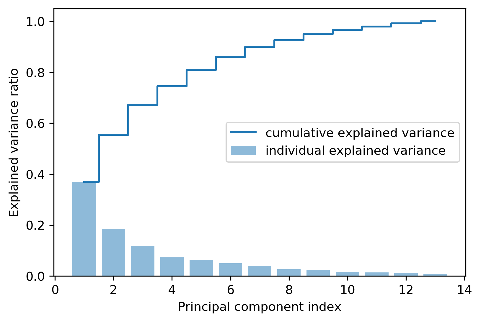
PC1 alone accounts for only about 40% of the variance, and PC1 and PC2 together explain about 60%.
Building the projection matrix#
Select the first \(k\) eigenvectors to form the matrix \(W\):
# integrate eigenvalues  and eigenvectors
eigen_paris = [
    (np.abs(eigen_vals[i]), eigen_vecs[:, i]) for i in range(len(eigen_vals))
]
# sort according to eigenvalues
eigen_paris.sort(key=lambda x: x[0], reverse=True)
# pick up the first 2 eigenvalues
w = np.hstack([eigen_paris[0][1][:, np.newaxis], eigen_paris[1][1][:, np.newaxis]])
# check matrix x
w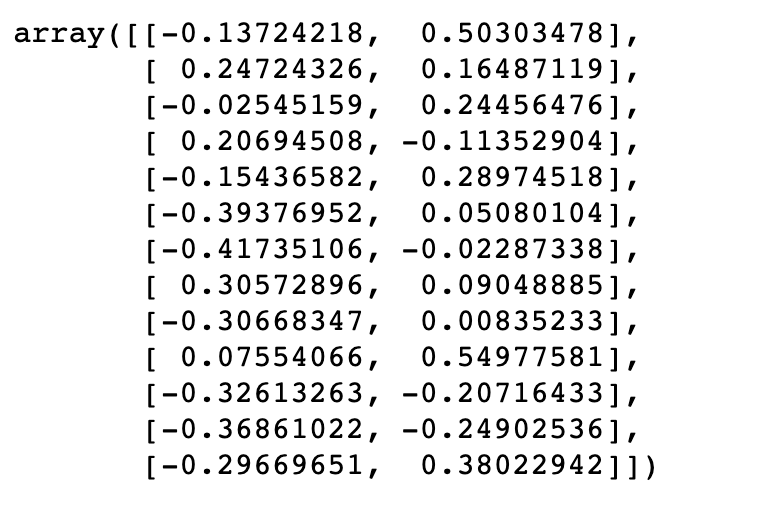
Transforming the data#
# reduce dimension
x_train_pca = x_train_std.dot(w)
# check resulted data
x_train_pca.shape
(124, 2)
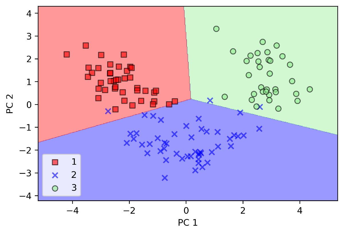
Finally, plot the result and color the points by their original labels. Keep in mind that PCA is an unsupervised technique: it never sees the labels.
# init colors and markers
colors = ["r", "b", "g"]
markers = ["s", "x", "o"]
# plot scatter
for l, c, m in zip(np.unique(y_train), colors, markers):
    plt.scatter(
        x_train_pca[y_train == l, 0],
        x_train_pca[y_train == l, 1],
        c=c,
        label=1,
        marker=m,
    )
# add label and legend
plt.xlabel("PC 1")
plt.ylabel("PC 2")
plt.legend(loc="lower left")
plt.savefig("distribution.png", format="png", bbox_inches="tight", dpi=300)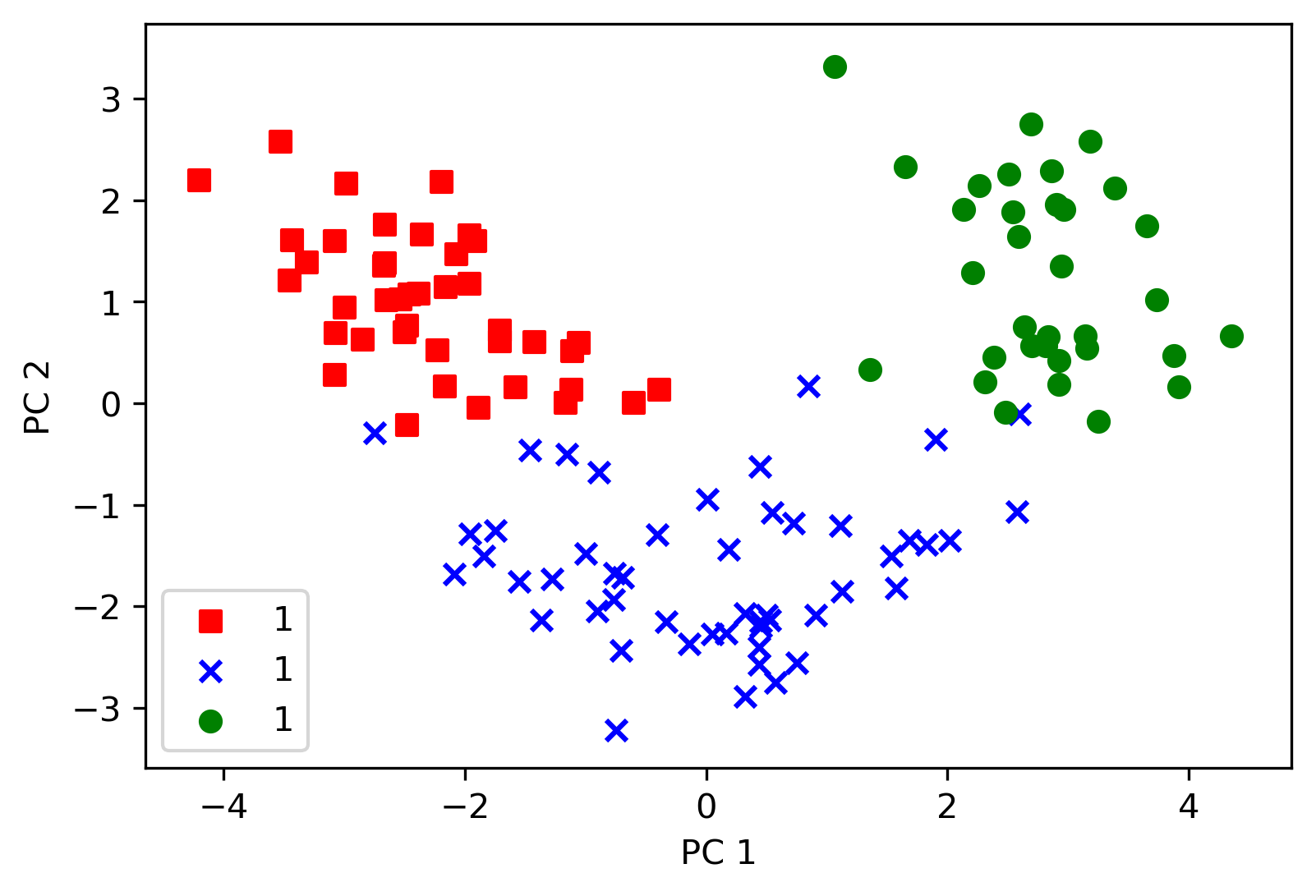
PCA with scikit-learn#
scikit-learn makes PCA much easier. Import the modules:
from sklearn.decomposition import PCA
from matplotlib.colors import ListedColormap
from sklearn.linear_model import LogisticRegression
Define a helper that plots the decision regions of a classifier:
def plot_dicision_regions(X, y, classifier, resolution=0.02):
    # init markers and colors
    markers = ("s", "x", "o", "^", "v")
    colors = ("red", "blue", "lightgreen", "gray", "cyan")
    cmap = ListedColormap(colors[: len(np.unique(y))])
    # create info for plot region
    x1_min, x1_max = X[:, 0].min() - 1, X[:, 0].max() + 1
    x2_min, x2_max = X[:, 1].min() - 1, X[:, 1].max() + 1
    xx1, xx2 = np.meshgrid(
        np.arange(x1_min, x1_max, resolution), np.arange(x2_min, x2_max, resolution)
    )
    # test classifier's accurate
    z = classifier.predict(np.array([xx1.ravel(), xx2.ravel()]).T)
    z = z.reshape(xx1.shape)
    # plot decision region
    plt.contourf(xx1, xx2, z, alpha=0.4, cmap=cmap)
    # set x,y length
    plt.xlim(xx1.min(), xx1.max())
    plt.ylim(xx2.min(), xx2.max())
    # plot result
    for idx, cl in enumerate(np.unique(y)):
        plt.scatter(
            x=X[y == cl, 0],
            y=X[y == cl, 1],
            alpha=0.6,
            color=cmap(idx),
            edgecolor="black",
            marker=markers[idx],
            label=cl,
        )
Run PCA, fit a logistic regression classifier on the two components, and plot its decision regions:
# create pca instance
pca = PCA(n_components=2)
# create classifier instance
lr = LogisticRegression()
# reduce dimension for  data set
x_train_pca = pca.fit_transform(x_train_std)
x_test_pca = pca.transform(x_test_std)
# classify x_train_pca
lr.fit(x_train_pca, y_train)
# plot decision region
plot_dicision_regions(x_train_pca, y_train, classifier=lr)
# add info
plt.xlabel("PC 1")
plt.ylabel("PC 2")
plt.legend(loc="lower left")
plt.show()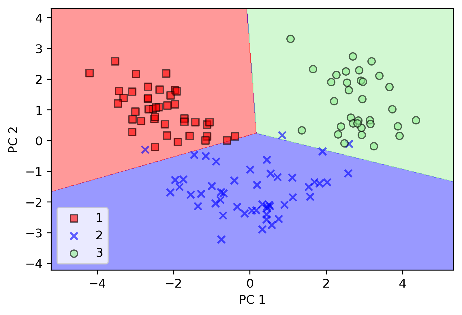
The classifier separates the three classes well when compared against the true labels.
n_components=None to keep all principal components, and read explained_variance_ratio_ to get the explained variance ratio of each component.